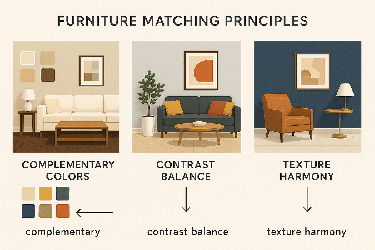
إن تنسيق الأثاث مع الجدران والأرضيات يعني خلق علاقة بصرية ولونية متناسقة بين العناصر الثلاثة، لتحقيق الانسجام والانسيابية والتوازن الوظيفي في المساحات الداخلية. وفي سياق التصميمات الداخلية لدولة الإمارات العربية المتحدة، يتضمن ذلك دمج مواد معمارية كالرخام والبلاط والخشب مع درجات ألوان ذات صلة ثقافية كالرملي والبيج والعاجي والفحمي. الهدف ليس التجانس، بل التماسك من خلال التباين والحجم وتناسق الألوان .
لماذا من المهم تنسيق الأثاث مع ألوان الجدران والأرضيات؟
يضمن التناغم بين الأثاث وألوان الجدران والأرضيات مساحة متوازنة وغامرة ومتناغمة عاطفياً تدعم التدفق الجمالي وتقسيم المناطق الوظيفية.
يُعد هذا المبدأ جوهريًا في التصميم الاحترافي، لأن الأسطح الثلاثة - الأرضية والجدار والأثاث - تُشكل المثلث البصري الذي يُحيط بكل غرفة. فالتركيبات غير المترابطة، مثل الجدران الداكنة مع الأرضيات والأثاث الداكن المتشابه، تُسطح عمق الغرفة، بينما قد تُشتت الألوان الزاهية للغاية النظر.
في الفلل والشقق في الإمارات العربية المتحدة، حيث تشيع التصميمات المفتوحة والأسقف العالية، يصبح تناسق الألوان أمرًا بالغ الأهمية للحفاظ على الوضوح والدفء. كما أن المساحة المنسقة جيدًا تُعزز القيمة المُدركة ، وتُحسّن تفاعل الإضاءة الطبيعية والاصطناعية، وتُرسّخ وجود الأثاث دون أي تشويش بصري.
ما هي الأخطاء البصرية التي تحدث عندما لا يتناسب الأثاث مع محيطه؟
عندما يتعارض الأثاث مع ألوان الجدران أو الأرضيات، فإنه يعطل التسلسل الهرمي البصري، ويقلل من الوضوح المكاني، ويقلل من الراحة.
تتضمن الأخطاء النموذجية ما يلي:
-
استخدام أثاث خشبي يطابق لون الأرضية بشكل كبير، مما يؤدي إلى اختفائها بصريًا.
-
وضع الأثاث المعدني ذو الألوان الباردة مقابل الجدران ذات اللون البيج الدافئ، مما يخلق تباينًا صارخًا.
-
التطابق المفرط - حيث يكون كل عنصر بنفس اللون أو النهاية - مما يجعل المساحة تبدو مسطحة وبلا حياة.
في التصميمات الداخلية لدولة الإمارات العربية المتحدة، غالبًا ما نشاهد مثل هذه التناقضات عندما يتم إدخال أنماط الأثاث المستوردة دون تعديلها لتتناسب مع مواد الأرضيات الإقليمية مثل الرخام الداكن أو السيراميك البيج.
كيف يؤثر تدفق الألوان على إدراك المساحة في منازل الإمارات العربية المتحدة؟
يشير تدفق الألوان إلى الانتقال السلس للنغمات عبر الأسطح، وهو يؤثر بشكل كبير على عمق الغرفة والراحة والنطاق البصري في منازل الإمارات العربية المتحدة.
عندما تتحول الألوان بشكل منطقي - من الأرضيات الداكنة إلى الجدران ذات الألوان المتوسطة إلى الأثاث ذي اللمسات الفاتحة - فإنها تخلق طبقات رأسية تحاكي تدرجات الضوء الطبيعي ، وخاصة في الغرف ذات الضوء النهاري الكثيف.
على سبيل المثال:
-
تبدو شقة دبي الحديثة ذات الأرضيات الحجرية الكريمية والجدران ذات اللون البني الفاتح أكثر اتساعًا عندما يقدم الأثاث تناقضات ناعمة - مثل اللون الرمادي أو خشب البلوط الدافئ - بدلاً من الألوان المتنافسة.
-
في المساحات الأصغر حجمًا في أبو ظبي، يساعد التصميم المتناسق على الحفاظ على الانفتاح المكاني دون التضحية بالتفاصيل أو الثراء.
ما هو دور التصميم الثقافي في تناسق العناصر في التصميمات الداخلية الإماراتية؟
يؤثر التصميم الثقافي على تنسيق الأثاث في دولة الإمارات العربية المتحدة من خلال تفضيل التباين الغني والألوان الدافئة والملمس الذي يعكس البيئة الصحراوية والتراث المحلي.
يشير المصممون في كثير من الأحيان إلى:
-
لوحات الألوان ذات الألوان الأرضية مثل الرمل، واللون الطيني، واللون الجملي، واللون الزيتوني.
-
القوام المتناقض ، مثل الجدران الحجرية الخشنة المتوازنة مع الأثاث الخشبي المصقول الناعم.
-
إضاءة مميزة وعناصر خشبية منحوتة مستوحاة من العمارة الإماراتية التقليدية.
في هذه البيئات، لا يعني التناسق تشابه كل شيء، بل مواءمة الأجواء العاطفية للمكان مع التوقعات الثقافية، أي الجمع بين الثراء البصري والانضباط.
كيف يمكنك تنسيق الأثاث بناءً على مادة الأرضيات؟
يُعدّ نوع ودرجة لون وتشطيب أرضياتك أساسًا لكيفية اندماج الأثاث بصريًا في المساحة. في منازل الإمارات العربية المتحدة، حيث تهيمن مواد مثل الرخام والبلاط والخشب والفينيل، يتطلب كلٌّ منها نهجًا مُصمّمًا خصيصًا للتباين وتنسيق الألوان الأساسية وترسيخ المكان.
ما هو الأثاث الذي يتناسب بشكل أفضل مع أرضيات الرخام الشائعة في فلل الإمارات العربية المتحدة؟
تُعد الأرضيات الرخامية، وخاصةً باللون البيج أو الكريمي أو الأبيض مع عروق رمادية، من العناصر الأساسية الفاخرة في الفلل الإماراتية والشقق الكبيرة.
إرشادات مطابقة المفاتيح:
-
استخدم أثاثًا ذا جاذبية بصرية. لأن الرخام يعكس الضوء، وغالبًا ما يكون ذو لون بارد، فاختر الأخشاب ذات الألوان الدافئة (مثل الجوز أو الساج) لإضفاء لمسة جمالية على المساحة.
-
استخدم التشطيبات غير اللامعة. الأثاث اللامع ينافس بريق الرخام. اختر الورنيش غير اللامع، أو الأقمشة المزخرفة، أو الجلد الناعم الملمس لإضفاء لمسة من النعومة.
-
حافظ على توازن كثافة النمط. تجنب التنجيد ذي النقوش الكثيرة عندما تكون عروق الرخام قوية - استخدم ألوانًا متجانسة أو نسجًا باهتة لتجنب التحميل البصري الزائد.
مثال: خزانة جانبية من خشب الجوز من ماركة Klikettick بمقابض من النحاس غير اللامع توفر العمق والتباين مع أرضيات الرخام الأبيض من كارارا في منزل في نخلة جميرا.
كيف تقوم بتنسيق الأثاث مع الأرضيات الخشبية الفاتحة أو المتوسطة أو الداكنة؟
تُضفي الأرضيات الخشبية الدفء وتنوعًا في خطوطها، وهو أمرٌ أساسيٌّ للديكورات الداخلية الإماراتية التقليدية والبسيطة على حدٍ سواء. ولكن تنسيق الألوان هنا مسألة توازن، وليس تقليدًا .
أرضيات خشبية فاتحة اللون (الرماد، البلوط الفاتح):
-
فضّل الأثاث متوسط الحجم أو الداكن لتجنب المظهر الباهت.
-
أضف تباينًا في الملمس — مثل الخيزران أو الجلد أو الكتان.
أرضيات خشبية متوسطة الحجم (البلوط والكستناء):
-
استخدم أثاثًا أفتح أو أغمق ، ولكن أدخل عنصرًا عازلًا مثل سجادة محايدة.
-
أعطي الأولوية لللمسات المعدنية أو الحجرية لتجنب الرتابة.
الأرضيات الخشبية الداكنة (الجوز والونجي):
-
استخدمي المفروشات الفاتحة (البيج، والأبيض العاجي، والرمادي الفاتح) لكسر الثقل البصري.
-
قم بتباينها مع طاولات زجاجية أو خشبية فاتحة اللون لفتح المساحة.
نصيحة احترافية: لا تقم بتنسيق الأخشاب ذات النغمات الحمراء مع درجات اللون الرمادي الباردة - حيث ستتضارب النغمات الأساسية في المساحات الجافة ذات الإضاءة العالية الشائعة في شقق الإمارات العربية المتحدة.
ما هي قواعد مطابقة الأثاث لأرضيات السيراميك أو الفينيل؟
البلاط هو سطح الأرضيات الأكثر شيوعًا في المنازل متوسطة المدى والمنازل للإيجار في الإمارات العربية المتحدة ، حيث يوفر قاعدة محايدة - ولكن الحياد يمكن أن يعمل لصالح التصميم أو ضده إذا تم تجاهل النغمات الأساسية.
بلاط السيراميك:
-
تتميز غالبًا بقواعد باللون البيج أو الرملي أو الرمادي .
-
يمكنك تنسيقها مع أثاث بألوان دافئة للحصول على نسخ باللون البيج، وقطع معدنية باردة أو مطلية باللون الرمادي.
-
إذا كان البلاط يحتوي على نمط (طبعة حجرية، دوامة غير لامعة)، احرص على إبقاء الأثاث نظيفًا وذو ألوان ثابتة .
أرضيات الفينيل:
-
تُستخدم غالبًا في المطابخ المفتوحة والمساحات المدمجة .
-
استخدم أثاثًا مدمجًا وقابلًا للتطوير للحفاظ على الوضوح المكاني.
-
استخدم السجاد والمنسوجات ذات الطبقات المتعددة لمنع صدى الشعور الصناعي.
على سبيل المثال: في استوديو في الشارقة مع ألواح الفينيل ذات اللون الرملي، تمزج أريكة Klikettick الرفيعة ذات اللون البيج مع الأرجل الخشبية المدببة بين الفائدة والنعومة.
كيف تؤثر ألوان الجدران على اختيار الأثاث ووضعه؟
الجدران هي أكبر سطح رأسي في الغرفة، ويؤثر لونها وملمسها وتشطيبها على كيفية إدراك كل قطعة أثاث. في منازل الإمارات العربية المتحدة ذات الإضاءة الجيدة والأسقف العالية، يُعدّ تباين الجدران والأثاث أكثر من مجرد خيار تصميمي، بل ضرورة مكانية.
ماذا يحدث عندما يعكس أو يمتص تشطيب الحائط الضوء بشكل مختلف؟
تُحدد تشطيبات الجدران كيفية ظهور الألوان في أوقات مختلفة من اليوم. فالتشطيبات اللامعة تعكس مزيدًا من الضوء وتُضفي على الألوان مظهرًا أكثر برودة، بينما تمتص الجدران غير اللامعة الضوء وتُعمّق إدراك الألوان.
-
الجدران البيضاء اللامعة قد تجعل الأثاث يبدو أغمق وأثقل. وزّعها بأقمشة فاتحة أو عناصر زجاجية .
-
تعمل الجدران ذات اللون البيج غير اللامع أو البني الداكن على تخفيف الظلال وتتناسب بشكل جيد مع كل من الخشب الدافئ والألوان المحايدة المزخرفة .
-
إن التشطيبات المزخرفة (مثل الجص أو الجبس) تخلق اهتمامًا بصريًا في حد ذاتها - لذا قم بإقرانها بأثاث أنيق وغير مزخرف .
نظرة على الإمارات العربية المتحدة: في شقة بنتهاوس في دبي ذات جدران مصقولة باللون الأبيض العاجي، تتجنب الأريكة ذات اللون الرملي المنخفض من Klikettick انعكاس الضوء المفرط وتحافظ على إيقاع بصري هادئ.
هل يجب عليك اختيار جدار مميز أو إبقاءه محايدًا؟
يمكن للجدران المميزة أن تعمل على تثبيت المساحة أو تعطيل التدفق البصري - اعتمادًا على الدرجة اللونية والتباين وحجم الغرفة.
-
تعمل الجدران الجريئة (الأخضر الغامق، والأحمر الطيني، والفحمي) بشكل أفضل في التصميمات المفتوحة أو الغرف ذات الأثاث البسيط.
-
قم بتنسيق الجدران الجريئة مع الأثاث ذي الألوان الفاتحة أو الأرجل المعدنية لتجنب الثقل.
-
إذا كنت تستخدم ورق حائط منقوش ، تأكد من أن الأثاث المحيط يظل هادئًا من حيث النغمة ونظيفًا من حيث الملمس .
متى يجب البقاء على الحياد:
-
في المساحات الصغيرة مثل شقق دبي أو استوديوهات الشارقة، استخدمي الجدران ذات اللون الأبيض العاجي أو الرملي أو الرمادي الناعم .
-
وهذا يدعم وضع الأثاث بشكل مرن ويقلل من خطر الازدحام البصري.
كيف يمكنك تحديد الدرجة اللونية الصحيحة في الطلاء لتتناسب مع ديكورك؟
تعتبر الألوان الأساسية هي الألوان المخفية تحت لون سطح الطلاء، وهي تتحكم في كيفية تفاعل هذا اللون مع الضوء والمفروشات.
خطوات فك رموز درجات ألوان الجدران:
-
استخدم بطاقة بيضاء بجوار الحائط لإظهار الدفء أو البرودة المخفية.
-
قم بالرجوع إلى أثاثك — على سبيل المثال:
-
تتناقض الجدران الرمادية الباردة مع الأثاث المصنوع من خشب البلوط الأحمر .
-
تتناغم الجدران ذات اللون البيج الدافئ مع درجات اللون البني الفاتح والعاجي والجوز .
أمثلة على مطابقة النغمة الأساسية:
-
درجات الألوان الباردة (الرمادي المزرق، والأبيض الجليدي) → يمكن إقرانها بالكروم والورنيش والخشب ذي الألوان الباردة
-
درجات الألوان الدافئة (الرمادي، البني الداكن، الكريمي) → يمكن تنسيقها مع الجلد، الروطان، والأخشاب الداكنة
نصيحة للمصممين المحترفين: استخدم اختبار تناغم الألوان من Klikettick لتصور كيفية تفاعل لون الطلاء الخاص بك مع درجات ألوان الأثاث قبل الشراء.
كيف يمكنك تنسيق الجدران والأرضيات والأثاث معًا بسلاسة؟
التصميم الداخلي الاحترافي الحقيقي لا يعزل العناصر، بل يجمعها في نظام بصري متكامل. في التصميمات الداخلية في الإمارات العربية المتحدة، حيث تتنوع الفخامة والإضاءة والتصميم من الفلل إلى الشقق الصغيرة، يكمن السر في انسياب الألوان، وتباين الملمس، والترابط الاستراتيجي.
ما هي عملية بناء مساحة متناغمة بصريًا خطوة بخطوة؟
استخدم إطار التناغم ثلاثي الاتجاهات هذا لكل غرفة:
-
ابدأ بالسطح المهيمن لديك (عادةً الأرضية).
-
حدد لونه الأساسي (على سبيل المثال، البلاط البيج = دافئ؛ الحجر الرمادي = بارد).
-
لاحظ نسيجها وانعكاسها.
-
قم بتحديد لون الحائط والانتهاء منه بعد ذلك.
-
اختر درجة لونية واحدة للأعلى أو للأسفل من الأرضية (أفتح من أجل الانفتاح، وأغمق من أجل العمق).
-
قم بمطابقة اللون الأساسي للأرضية أو الجسر بلون محايد (على سبيل المثال، جدار كريمي + بلاط بيج دافئ = متناغم).
-
استخدم الأثاث كمرساة بصرية.
-
قم بتقديم التباين من خلال المادة (الخشب، القماش، الجلد) أو الشكل.
-
حافظ على تناسق درجات اللون الأساسية. لا تخلط أبدًا لون البلوط الدافئ مع الجدران الرمادية الباردة دون استخدام عازل محايد.
-
اختبار التدفق البصري.
-
استخدم لوحة عينات الألوان وتحقق منها تحت ضوء النهار الطبيعي والإضاءة الداخلية.
-
استخدم السجاد والعناصر المميزة كمترجمين للألوان بين الأسطح.
كيف تساعد السجاد والفن والإضاءة في سد فجوات اللون أو الملمس؟
هذه هي الأنسجة الضامة لمخططك الداخلي:
-
السجاد:
-
قم بتثبيت الأثاث وربط الألوان بين الأرضيات الداكنة والجدران الفاتحة.
-
في منازل الإمارات العربية المتحدة، توفر الألياف الطبيعية (مثل الجوت أو السيزال) تباينًا قابلاً للتنفس مع البلاط السيراميكي البارد.
-
فن:
-
استخدم فنون الحائط لتعكس ألوان الأثاث وتقاوم فراغ الحائط.
-
على سبيل المثال: يمكن لإطار داكن حول لوحة لمناظر طبيعية صحراوية أن يربط بصريًا الجدران البيجية بأرضيات الخشب الداكنة.
-
إضاءة:
-
استخدم مصابيح LED الدافئة في الأماكن ذات المواد الباردة لاستعادة التوازن.
-
تساعد الإضاءة المعلقة فوق الأثاث على جذب الانتباه إلى الشكل وتمنع انحراف اللون عبر المناطق المفتوحة.
مثال حقيقي من الإمارات العربية المتحدة: في شقة في وسط مدينة دبي ذات أرضية رمادية وجدران بيضاء، ربطت سجادة Klikettick المصنوعة من الصوف باللون البيج الدافئ أريكة باللون البني الفاتح وطاولة قهوة معدنية سوداء، مما أدى إلى خلق وحدة لونية كاملة.
ما هي الأخطاء الشائعة التي يجب عليك تجنبها في المباريات الثلاثية؟
تجنب الأخطاء التالية التي تؤدي إلى كسر التخطيط:
-
الكثير من التشابه:
-
جدران بيضاء + أرضيات باهتة + أثاث كريمي = مساحة باهتة وغير مؤرضة.
-
تجاهل النغمات الأساسية:
-
يؤدي مطابقة جدار رمادي بارد مع أرضية صفراء بيج إلى خلق حالة من التوتر.
-
زيادة تحميل التباين:
-
أرضية مظلمة + أريكة سوداء + جدار فحمي = ثقل بصري وخوف من الأماكن المغلقة.
-
متلازمة الأثاث العائم:
-
عدم وجود سجادة أو قطعة أساسية = المكان يفتقر إلى التماسك والغرض.
نصيحة احترافية: قم دائمًا بإدراج عنصر موحد (سجادة أو عمل فني أو إضاءة محورية) يدمج الأرضية والجدار والأثاث بصريًا.
ما هي بعض الأمثلة الحقيقية للتصميمات الداخلية المتطابقة في منازل الإمارات العربية المتحدة؟
في منازل الإمارات العربية المتحدة، من أبراج دبي العصرية إلى الفلل الكلاسيكية في أبوظبي، يُجسّد تناغم الأرضيات والجدران والأثاث أكثر من مجرد أسلوب: إنه تعبير ثقافي عن المساحة والفخامة وكرم الضيافة . إليكم كيف يتحقق التناغم في ثلاثة تصاميم داخلية حقيقية.
كيف تم تصميم غرفة المعيشة الحديثة في دبي باستخدام الألوان المحايدة الدافئة؟
الموقع: أبراج بحيرات جميرا، دبي
الأرضية: بلاط ترافرتين مصقول (كريمي، لون دافئ)
الحائط: طلاء غير لامع بلون رملي
الأثاث: أريكة كليكيتيك المخملية بلون الطين الخافت
المراسي: سجادة من الجوت المنسوج + إضاءة بلمسات برونزية
ماذا نجح؟
-
تشارك البلاط الكريمي والجدران الرملية قاعدة دافئة مشتركة، مما أدى إلى تأريض المساحة.
-
قدمت أريكة التيراكوتا تباينًا متحكمًا به دون تغيير النغمات الأساسية.
-
ساعدت الإضاءة البرونزية والأنسجة الطبيعية على منع الرتابة وإضافة الدفء.
النتيجة البصرية:
غرفة معيشة ناعمة مشمسة تمنحك شعورًا بالهدوء والقصد والفخامة الطبيعية - مثالية للترفيه أثناء النهار والاسترخاء في المساء.
كيف نجحت شقة في أبو ظبي في دمج الأرضيات الباردة مع الأثاث الداكن؟
الموقع: جزيرة الريم، أبوظبي
الأرضية: خشب رمادي مصفح (لون هادئ)
الحائط: طلاء ساتان أبيض لامع
الأثاث: قسم كليكيتيك المعياري من قماش تويد الفحمي
المراسي: سجادة باللون الأزرق الرمادي المتدرج + رف عائم من خشب الجوز
ماذا نجح؟
-
خلق الجدار والأرضية الباردان غلافًا بسيطًا.
-
أضافت المقاعد الداكنة ذات الملمس المميز وزنًا ورقيًا.
-
سجادة متدرجة الألوان تنتقل بين الحائط والأثاث دون فواصل قاسية.
النتيجة البصرية:
شقة حديثة ومدمجة تبدو متكاملة من الناحية المعمارية - باستخدام ضبط الألوان والملمس المادي كأدوات توحيدية.
ما هي تصاميم المداخل التي تُظهر مزيجًا مثاليًا بين الأثاث والجدران؟
الموقع: فيلا مردف، دبي
الأرضية: سيراميك منقوش بفسيفساء بلون الطين البيج
الحائط: جص كريمي غير لامع
الأثاث: وحدة تحكم Klikettick من خشب الساج القديم
المراسي: مرآة دائرية كبيرة ذات حافة نحاسية مصقولة + مزهرية خزفية باللون المرجاني الباهت
ماذا نجح؟
-
ترددت نغمات الأرضية الترابية في الخشب الدافئ للوحدة التحكم.
-
أضاف السطح العاكس للمرآة الضوء ورفع المساحة الضيقة.
-
تفاصيل السيراميك والمعدن تجمع بين اللون والملمس عبر جميع الأسطح.
النتيجة البصرية:
مدخل يهمس بالفخامة دون إفراط - شكل متناغم، ولون، والمادة في منطقة انتقالية غالبًا ما يتم تجاهلها.
كيف يمكنك البدء في إنشاء مساحة متناسقة الألوان اليوم؟
أين يمكنك استكشاف مجموعات الغرف المصممة مسبقًا من Klikettick؟
يعرض دليل "تناغم الغرف" من "كليكتيك" مجموعات أثاث مختارة بعناية، تتوافق مع ألوان الأرضيات والجدران الشائعة في الإمارات العربية المتحدة. تتميز الغرف بتصاميم متناسقة الألوان، وأنماط معززة للتباين، وأدلة تصميم مصممة خصيصًا للعمارة المحلية. تتميز كل مجموعة بتناغم السجاد والجدران والأثاث مع الألوان الأساسية والإضاءة.
كيف تستخدم اختبار تناغم الألوان أو أدوات المطابقة الخاصة بـ Klikettick؟
يتيح اختبار مطابقة الألوان من Klikettick للمستخدمين اختيار ألوان الأرضيات والجدران الحالية، ثم اقتراح أثاث من مجموعات ذات درجات ألوان ومواد متوافقة. تدمج الأداة عينات الأقمشة وأنواع الأخشاب وخيارات التشطيب لتحقيق تناسق بصري عالي.
كيفية البدء في التوفيق بين الأشياء كالمحترفين (حتى لو لم تكن مصممًا)
ابدأ بتحديد لونك المفضل: إما لون الجدران أو الأرضيات. اختر أثاثًا بدرجات ألوان متناسقة أو متناسقة، ثم أضف إليه السجاد أو المنسوجات أو الإضاءة لسد أي فجوات. تساعد أدوات مثل دليل Klikettick للتنسيق ولوحات المزاج المرئية على تبسيط العملية، حتى للمبتدئين.
من يمكنك الاتصال به للحصول على نصائح حول التصميم الشخصي في الإمارات العربية المتحدة؟
يقدم كليكيتيك استشارات تصميم مجانية عبر فريق التصميم الخاص به. يمكن لسكان الإمارات العربية المتحدة الحجز عبر الإنترنت للحصول على نموذج تصميم شخصي، واقتراحات للأثاث، ونصائح لتنسيق الألوان بناءً على الإضاءة، وحجم الغرفة، وتباين المواد.
الأسئلة الشائعة حول تنسيق الأثاث مع الجدران والأرضيات
ما هي ألوان الأثاث التي تتناسب مع الأرضيات الكريمية والجدران الرمادية؟
استخدم أثاثًا بلون رمادي داكن أو رمادي فاتح أو رملي لربط الأرضيات الكريمية الدافئة بالجدران الرمادية الباردة. كما أن خشب الدردار، واللمسات المعدنية السوداء، والإضاءة الذهبية الناعمة تُضفي لمسةً من التناغم.
هل يمكنك مزج الجدران ذات الألوان الدافئة مع الأثاث ذات الألوان الباردة؟
نعم، ولكن احرص على موازنة الألوان بلمسات محايدة. على سبيل المثال، تتناسب الجدران البيج والأثاث الرمادي بشكل رائع مع السجاد البني الفاتح، أو الإضاءة النحاسية، أو الأعمال الفنية التي تجمع بين درجات الألوان الدافئة والباردة.
كيف أختار سجادة لا تتعارض مع بلاطي أو أريكتي؟
نسّق لون السجادة مع الأرضية أو الأريكة، وليس كليهما. استخدم سجادًا متعدد الألوان لسد الفجوات، واختار البساطة عندما تكون بلاطاتك أو أريكتك جريئة أو منقوشة.
ما هو أثاث Klikettick الذي يناسب المنازل المفتوحة في الإمارات العربية المتحدة؟
تُعد مجموعات كليكيتيك "تون أون تون" و"نيوترال كور" مثاليةً للتصميمات المفتوحة. فهي تتضمن مجموعات مُجهزة مسبقًا لمناطق متعددة، وأدوات تنسيق لتنسيق الأرضيات والجدران.
الخلاصة: تصميم ديكور داخلي متناسق يبدأ بالانسجام
تنسيق الأثاث مع الجدران والأرضيات لا يقتصر على الأناقة فحسب، بل يشمل أيضًا البنية والتوازن والوضوح. كل لون وملمس وتنسيق يُسهم في انسياب المساحة والشعور العاطفي في منزلك. في الإمارات العربية المتحدة، حيث تلتقي المواد الفاخرة والتصاميم الجريئة بالبساطة، يصبح التنسيق ضرورة عملية وثقافية.
سواءً كنت تُرسّخ فيلا عصرية بأرضيات رخامية أو تُصمّم شقة ببلاط بيج دافئ، فإن فهم النغمات الأساسية والنسب والتباين أمرٌ أساسي . باتباع مبادئ مطابقة الألوان التي يُطبّقها الخبراء، تضمن أن تبدو كل غرفة مُوحّدة - بصريًا وعاطفيًا ومكانيًا.
لمن يبحثون عن الدقة الاحترافية دون تعقيدات، تقدم كليكيتيك مجموعات متناسقة، وخدمات التخصيص، والاستشارات المصممة خصيصًا لمنازل الإمارات العربية المتحدة. من الفكرة إلى التنفيذ، يبدأ تصميمك الداخلي المثالي بقرار واحد: التوازن.