اختيار لون الأثاث المناسب في دبي ليس مجرد مسألة ذوق، بل هو تناغم دقيق بين ضوء الصحراء ، وانعكاسية السطح ، ودرجات الألوان المعمارية الإقليمية . في مناخ يتميز بتعرضه العالي للأشعة فوق البنفسجية، وديكورات داخلية مشبعة بأشعة الشمس، ومواد مثل الرخام والزجاج والخشب المطلي ، يتقلب مظهر الألوان بشكل كبير على مدار اليوم. ما يبدو كزهرة مريمية باردة في ضوء الصباح قد يبدو رماديًا باهتًا عند الغسق. والأسوأ من ذلك، أن عدم تطابق درجات الألوان بين الجدران والأرضيات والمفروشات قد يُزعزع استقرار لوحة الألوان بأكملها.
يقدم هذا الدليل خارطة طريق تقنية وعملية لإتقان ثبات الألوان في ظل ظروف دبي الفريدة. سواء كنت تُجهّز شقة شاهقة في وسط المدينة أو فيلا في المرابع العربية، ستتعلم كيفية اختيار درجات الألوان والقوام التي تُحسّن المظهر البصري - من الصباحات المشمسة إلى الأمسيات المُضاءة بمصابيح LED . سنتناول استراتيجية التناغم اللوني، ومقاومة الأشعة فوق البنفسجية، والإضاءة الذكية، والتحكم في الوهج الموسمي ، لنزودك بالرؤية اللازمة لتصميم ديكورات داخلية تبدو مُصممة ومُتناسقة في كل ساعة.
فهم تحديات الإضاءة والألوان الفريدة في دبي
تأثير أشعة الشمس الصحراوية وكثافة الأشعة فوق البنفسجية العالية
ضوء دبي لا يلين، ويتغير بسرعة. من وهج الصباح الباكر إلى سطوع الظهيرة الكامل وأمسيات الكهرمان الدافئة، يجب أن يكون اختيارك للألوان ثابتًا ومدروسًا.
-
شدة الأشعة فوق البنفسجية عالية على مدار العام. صبغات المنسوجات غير المخصصة للتعرض للأشعة فوق البنفسجية تتلاشى أو يتغير لونها مع مرور الوقت.
-
انعكاس ضوء الشمس على الأرضيات والجدران ذات الألوان الفاتحة يزيد من الوهج. قد تبدو الأقمشة الداكنة أفتح؛ وقد تبدو الأريكة البيضاء كريمية اللون تحت ضوء الظهيرة.
-
التفاعل المادي : الرخام اللامع يعزز الارتداد؛ الستائر الثقيلة تخلق التباين ولكنها تزيد أيضًا من الدفء.
نصيحة احترافية: اختر الأكريليك المصبوغ بالمحلول أو مخاليط البوليستر المخصصة للاستخدام الخارجي مثل Sunbrella أو Revolution - والتي تتمتع بتصنيف يتحمل أكثر من 2000 ساعة من أشعة الشمس فوق البنفسجية مع صبغة مضمونة مقاومة للبهتان.
انعكاسية الرخام والبلاط والأسطح الجدارية المحايدة
تُحسّن التشطيبات المصقولة إدراك اللون وامتصاص الضوء. قد تبدو الأريكة التي تبدو بلون بني فاتح في صالة عرض بلون الخردل في توهج دبي الطبيعي، وذلك بفضل تداخل الألوان الدافئة من البلاط والرخام.
-
تعكس الأرضيات المصنوعة من الرخام الكريمي والبلاط الباهت الضوء الدافئ على الأرائك.
-
يلقي الطلاء الأساسي ذو اللون الفاتح (الأبيض المصفر، والأبيض البني) انعكاسات ناعمة تؤثر على مظهر اللون.
-
تعمل الطاولات ذات المرايا والزجاج على تعزيز الارتداد والتشويه.
الحل: اختر أقمشة التنجيد ذات اللمعان المنخفض أو غير اللامعة - مثل أقمشة الكتان أو المخمل المنسوج - التي تعمل على تشتيت الانعكاس وتحافظ على الدرجة اللونية الحقيقية.
تأثيرات التخطيط: التصاميم المفتوحة والمناظر الجنوبية
تتميز منازل دبي المميزة بجدران زجاجية واسعة وتدفق داخلي وخارجي متناغم. تُعزز هذه العناصر المعمارية الإضاءة الطبيعية، مما يُشكل تحديًا إضافيًا لثبات الألوان.
-
تتمتع الغرف المواجهة للجنوب بضوء الشمس من الصباح حتى غروب الشمس.
-
تضيف الجدران المطلية باللون الأصفر البيج أو الفانيليا الدفء إلى الضوء المحيط، مما يؤثر على قراءات اللون.
-
تساهم الأسطح اللامعة المرتفعة في انجراف اللون عندما يضرب الضوء ركبتي الأسطح المتباينة.
إصلاح التصميم الذكي: استخدم درجات الألوان الترابية متوسطة (البني البني، الزيتوني، الكاكي) للأثاث الرئيسي. أضف لمسات من اللون الأزرق (الكرسي الزمردي، الكرسي البحري) في الزوايا لترسيخ التوازن.
أمثلة واقعية على سلوك الألوان في منازل دبي
تحول اللون من الصباح إلى المساء
الجدول الزمني لتغيرات الألوان:
-
9 صباحًا: ضوء النهار الناعم يحيد اللون الأزرق الداكن، مما يجعله عميقًا ولكن غنيًا.
-
الظهيرة: يغسل الوهج النغمات الداكنة نحو اللون الرمادي؛ ويلتقط اللون البني البني نغمات ذهبية أكثر دفئًا.
-
7 مساءً (في الداخل على مصابيح LED): تصبح الألوان أكثر تسطحًا؛ يتحول اللون الزيتوني إلى اللون الأخضر الرمادي تحت مصابيح LED ذات اللون الأبيض البارد.
رؤية إنسانية: في فيلا مارينا، بدت الأريكة الخضراء المائلة للرمادي مثالية في الصباح، لكنها أصبحت باهتة تحت ضوء النهار عند الظهيرة. استُبدلت ببياضات زيتونية اللون لدفء دائم.
تأثير تشطيب التصميم والتفاعل السطحي
سيناريوهات التحول اللوني المرئي:
|
التشطيب المحيط |
تأثير على أريكة توب |
التطابق المثالي |
|
أرضيات رخام كريمي |
يضيف لمسة صفراء إلى ظل اللون البني |
رمادي كاكي أو رمادي حجري |
|
جدران من خشب البلوط الأبيض |
يمتص الدفء الخافت تحت أشعة الشمس |
لمسات زرقاء باهتة أو رمادية |
|
طاولة قهوة لامعة |
يعكس الضوء العلوي على المفروشات |
الكتان غير اللامع أو المخمل الباهت |
في منازل المرابع العربية ، دفع الرخام المصقول، ودرجات اللون البيج، والتصميمات الخفيفة المصممين إلى اختيار اللون المريمية الباهتة مع بريق خافت بدلاً من اللون البني البني الدافئ - أو استبدالها بالكراسي ذات اللون الزمردي في مناطق المعيشة المظللة.
نظرية الألوان للتصميمات الداخلية المحايدة والمشرقة
فهم النغمات الأساسية في الطلاء والأقمشة
يُحدد تناغم الألوان ما إذا كانت أريكتك ستمتزج مع الألوان المحيطة أم ستتعارض معها. في دبي، قد تُطلى الجدران باللون الأبيض المصفر أو الرمادي المائل للبني، وغالبًا ما تحمل الأرضيات الرخامية لمسة دافئة. قد يميل القماش المُصنّف "رمادي داكن" إلى الرمادي البارد أو البيج الوردي، مما قد يُضفي على أريكتك مظهرًا مختلفًا تمامًا في الداخل.
-
يتناقض اللون البني المخضر مع الجدران ذات اللون البيج الأصفر.
-
يمتزج اللون الرمادي الدافئ أو لون الفطر بشكل رقيق مع التصميمات الداخلية ذات اللون الرملي.
-
تسمح الألوان المحايدة متوسطة الدرجة مثل اللون الرمادي الفاتح بانتقالات أكثر سلاسة تحت الضوء المتنوع.
نصيحة : تحقق دائمًا من ملصقات عينات القماش لمعرفة تفاصيل "الدرجات اللونية". افحص العينة في الموقع تحت ضوء النهار في دبي وإضاءة LED.
الألوان الدافئة مقابل الألوان الباردة تحت إضاءة LED والضوء الطبيعي
تختلف مصادر الإضاءة، مما يؤثر على إدراك درجات الألوان. يبدو ضوء النهار في دبي مائلًا للصفرة بعد الساعة العاشرة صباحًا، لكن مصابيح LED غالبًا ما تُصدر مصابيح بيضاء باردة أو مصابيح نهارية بدرجة حرارة 5000 كلفن. قد يجعل هذا المزيج الأرائك ذات الألوان الدافئة تبدو برتقالية أو غير متوازنة.
-
تبدو الأقمشة ذات الألوان الباردة (الأزرق الحكيم، والرمادي الناعم) واضحة في إضاءة LED ولكنها قد تبدو باهتة في منتصف النهار.
-
تضيف الألوان الدافئة (اللون الطيني، واللون الزيتوني) ثراءً إلى ضوء ما بعد الظهيرة الساخن.
-
تظل الألوان المحايدة المتوازنة (الحجر، والرمادي الكاكي) مستقرة عبر كلا المصدرين.
التجربة : عرض عينات من القماش في الساعة 9 صباحًا، تحت شمس الظهيرة، وباستخدام ضوء LED فقط.
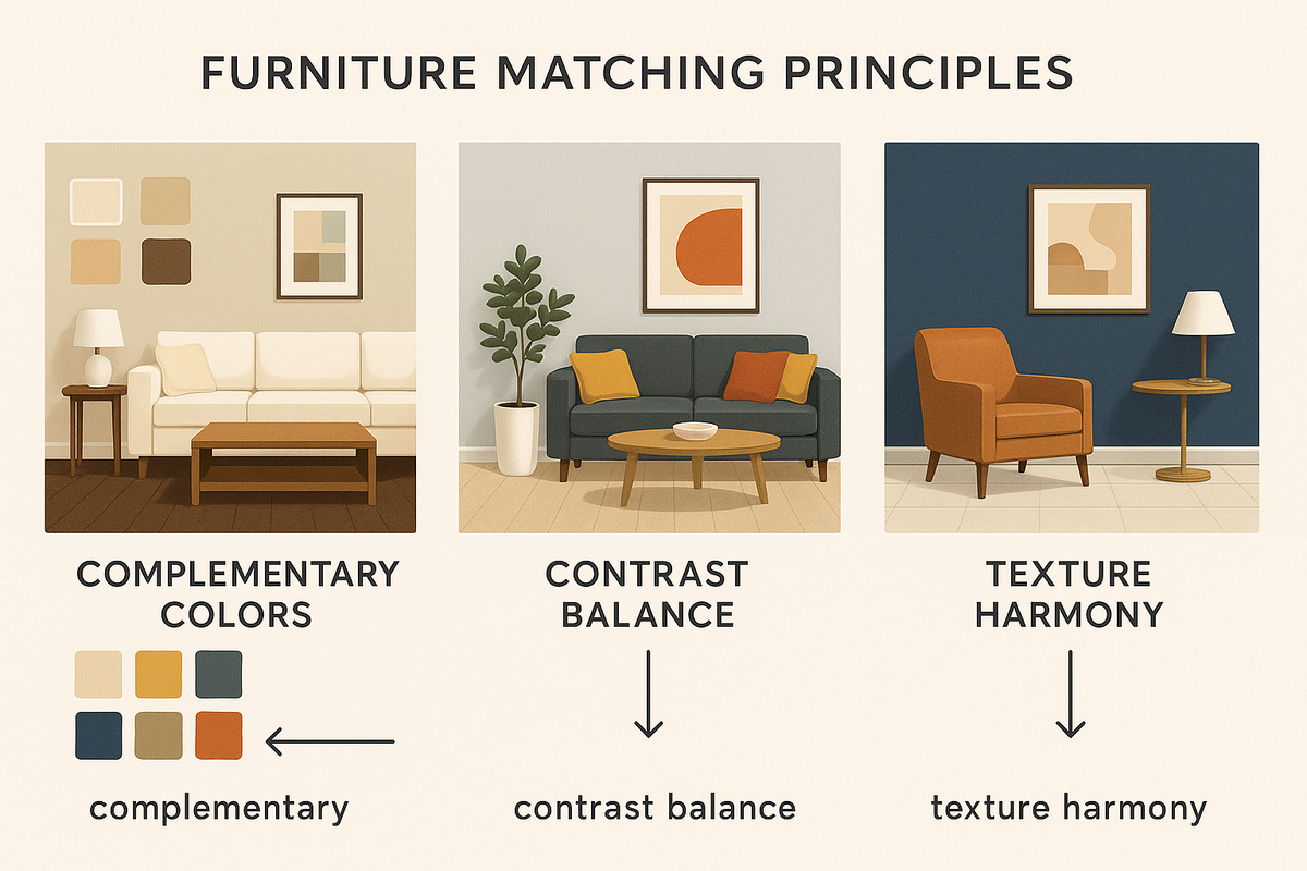
تنسيق الألوان المتناسقة مقابل اللمسات عالية التباين
عندما يتناغم اللون ويصبح محور الاهتمام. يستخدم التصميم المتناغم ألوانًا محايدة متناسقة مع تباين بسيط لتحقيق تناسق أنيق. تُضفي اللمسات عالية التباين - مثل الكراسي بذراعين الكحلي أو السجاد الزمردي - لمسة جمالية مميزة وتخفف من الوهج.
-
مخطط محايد: أريكة بلون بني فاتح + ستائر بلون الفطر + جدران بلون كريمي.
-
مخطط لهجة: أريكة باللون البني أو الرمادي مع عثماني زمردي وجوانب باللون الوردي الباهت.
رؤية صوتية : "في شقة مفروشة بشكل بسيط في دبي، يكسر العثماني البحري الرتابة البصرية دون المطالبة بديكور جريء بالكامل."
إدراك اللون تحت التبريد الاصطناعي
تُغيّر تيارات تكييف الهواء القوية تفاعل الرطوبة والضوء في الغرفة. يزيد الهواء الجاف من انعكاسية التشطيبات اللامعة، وقد يُفقد الأقمشة غير اللامعة بريقها.
-
احتفظ بالأقمشة بعيدًا عن تيار التيار المتردد المباشر لتجنب الجفاف أو تشوه اللون.
-
استخدمي الكتان المحكم أو المخمل غير اللامع ، الذي يحتفظ بثبات اللون حتى مع التبريد القوي.
-
تجنب وضع الأسطح اللامعة مباشرة تحت فتحات تكييف الهواء أو تركيبات LED البيضاء ، حيث يمكن أن يؤدي ارتداد الضوء إلى تضخيم تحولات الألوان.
لوحات الألوان المتوافقة مع دبي
الألوان المحايدة الترابية: البني الداكن، الرملي، الحجري
تعمل هذه الألوان بشكل أفضل في التصميمات الداخلية المضاءة بأشعة الشمس:
-
اللون البني : لون متوسط هادئ مثالي مع الرخام والبلوط الباهت.
-
الرمال : أكثر دفئًا قليلًا - مثالية لامتصاص الضوء دون وهج.
-
الحجر : مزيج متساوي من اللون الرمادي والبني - يدوم جيدًا عبر تحولات الإضاءة.
تخفي درجات الألوان الأرضية الغبار بشكل أفضل من اللون الأبيض، ولكنها لا تزال تحافظ على السطوع دون ثقل بصري.
لمسات مستوحاة من الصحراء: الطين، الزيتون، المغرة
توفر هذه الظلال الدفء والأهمية الإقليمية.
-
تربط الوسائد أو الأحواض ذات اللون الطيني الألوان الداخلية بألوان الصحراء.
-
تضفي الأرائك أو الكراسي ذات اللون الأخضر الزيتوني عمقًا بينما تقاوم وهج منتصف النهار.
-
تضيف السجاد أو الوسائد ذات اللون الأصفر ثراءً ناعمًا وأرضية بصرية.
تظل جميعها مستقرة تحت أشعة الشمس وتقاوم البهتان السريع.
تباين جريء: أزرق داكن، زمردي، أزرق مخضر غامق
الألوان المميزة الدرامية تناسب الفيلات والصالات والزوايا المميزة:
-
يبرز الكرسي ذو اللون البحري مقابل البلاط الكريمي والجدران البيج.
-
يبعث العثماني الزمردي حيوية في ظل الزاوية الناعمة.
-
تعمل الوسائد ذات اللون الفيروزي العميق على تخفيف درجات لون المرساة وتكمل اللمسات النهائية باللون الذهبي/النحاسي.
استخدمه باعتدال في المناطق الكبيرة المعرضة لأشعة الشمس لمنع الانجراف.
ألوان الباستيل والظلال الباهتة: رمادي، أزرق غباري، وردي باهت
الألوان الناعمة التي توفر الهدوء وتقليل الوهج:
-
يمتزج المريمية المغبرة مع الألوان الطبيعية ويخلق هدوءًا بصريًا.
-
يتناقض اللون الأزرق الباهت بشكل جميل مع اللون العاجي مع الحفاظ على الدقة.
-
توفر الوسائد ذات اللون الوردي الخوخي لمسة أنثوية مع انعكاس منخفض.
تمتص هذه الألوان الضوء بدلاً من طرده، وهي مثالية للمساحات الهادئة أو الزوايا المظللة.
إضاءة الإمارات + سياق المواد: لماذا هو مهم؟
سيناريوهات التفاعل بين اللون والضوء
|
حالة الضوء |
التأثير البصري على اللون البني |
التأثير البصري على البحرية |
|
شمس الصباح (9 صباحًا) |
لون بني فاتح بارد ومنعش |
البحرية العميقة والغنية |
|
وهج منتصف النهار (الظهيرة) |
بني رمادي دافئ ذهبي |
أزرق بحري رمادي، مكتوم |
|
LED المسائي (7 مساءً) |
بني مزرق قليلاً |
أزرق بحري رطب، ناعم |
تحت أشعة الشمس القوية ، قد يبدو اللون البني الداكن ذهبيًا دافئًا؛ وقد يفقد اللون الأزرق البحري تشبعه. تميل مصابيح LED وحدها إلى تبريد الألوان المحايدة ما لم يكن لونها الأساسي دافئًا جدًا.
نصائح لتنسيق الطلاء والأرضيات
-
تتحول الجدران المطلية باللون البيج والأصفر من اللون الأخضر البني إلى اللون الأخضر الزيتوني.
-
تضفي الأرضيات الرخامية الباهتة لمسة دافئة على الأرائك ذات الألوان الباردة.
-
للحصول على تناغم محايد: قم بتنسيق المفروشات ذات اللون الرمادي الحجري مع الجدران ذات اللون الأصفر البيج وأضف لمسات من اللون الأزرق الفاتح أو الباهت .
أمثلة على المنازل الحقيقية وملاحظات الألوان
استوديو بسيط في دبي مارينا
أريكة بلون بني فاتح بجانب أرضية بيضاء بدت باهتة تحت إضاءة صالة العرض، لكنها أصبحت أكثر ثراءً بصريًا في فيلا رملية اللون عند الظهيرة. الحل: اختبار تحت النوافذ الغربية.
فيلا عائلية في المرابع العربية
بدت الستائر الرمادية المائلة للزرقة كألواح حجرية في صالة عرض، لكنها تحولت إلى درجات أرجوانية قاتمة تحت زجاج مواجه لغروب الشمس. ثم تحولت إلى ستائر من الكتان الزيتوني ، التي حافظت على طابعها الحيادي الدافئ طوال اليوم.
تاون هاوس في قرية جميرا الدائرية
بدا عثماني وردي باهتًا تحت أضواء LED السفلية. بعد وضعه بالقرب من ضوء النهار غير المباشر عبر ستائر شفافة، استعاد حيويته وخفّ بريقه.
قوائم المراجعة والجداول
كيفية اختبار ألوان الأثاث في المنزل
-
ألصقي 3-4 عينات على مربع الكرسي/القماش.
-
التفتيش في الساعة 9 صباحًا، و1 ظهرًا، و7 مساءً.
-
راقب اللون تحت ضوء الشمس ومع تشغيل/إيقاف مصابيح الغرفة.
-
لاحظ تغيرات النغمة الأساسية: هل اللون الأزرق البحري مشبع؟ هل يتوهج اللون البني؟ هل يبدو اللون المريمية باهتًا؟
جدول توافق الألوان
|
لون الحائط |
لمسة من القماش |
حالة الإضاءة |
تأثير النتيجة |
|
كريم بيج |
رمادي بني أو رمادي حجري |
ضوء النهار الساطع |
الحياد المتوازن |
|
الرخام الأبيض |
زيتون أو مريمية |
منتصف النهار + ضوء محيط |
الثراء الدافئ |
|
طلاء مصفر |
البحرية أو الزمرد العميق |
المناطق المظللة |
مرساة تباين واضحة |
|
البلوط الأبيض |
أزرق غباري أو أحمر خدود |
مزيج من LED وضوء النهار |
انسجام لطيف، يقلل من الوهج |
تنسيق ألوان الأثاث مع أسطح الغرف في ديكورات دبي الداخلية
أرضيات رخامية كريمية وجدران بيج أو بني فاتح
يعكس الرخام الكريمي انعكاسات ذهبية دافئة، محوّلاً درجات الرمادي إلى الأصفر. يمكن لأريكة رمادية متوسطة اللون، بجانب رخام أو أرضيات لامعة، أن تكتسب لونًا خردليًا تحت أشعة شمس الظهيرة. وبالمثل، تنعكس الجدران ذات الدرجات الصفراء على المفروشات.
-
تحتفظ الأقمشة ذات اللون الرمادي الحجري أو لون الفطر بحيادها بشكل أفضل.
-
يوفر المريمية المغبرة أو الزيتون الباهت نعومة دون تضخيم الدفء.
نظرة ثاقبة: في فيلا في جميرا، قام أصحاب المنازل باستبدال أريكتهم ذات اللون البني الفاتح بأريكة مخملية دافئة باللون الرمادي الحجري - وشهدوا المزيد من ثبات اللون طوال اليوم.
تنسيق الأرائك مع الستائر وطلاء الجدران
تُعدّ نسبة الستائر إلى الأثاث مهمةً في الإضاءة الساطعة. فالأثاث الناعم الذي يعكس الستائر بشكلٍ وثيقٍ جدًا قد يُشوّش الحدود البصرية. لذا، اختر درجات ألوانٍ متباينة، مع الحفاظ على نفس المجموعة اللونية.
-
ستارة أغمق بنسبة 10-15% من مساحة الأريكة.
-
مثال: ستائر كريمية + أريكة رملية بنية اللون + وسائد مبعثرة باللون المريمية.
نصيحة عملية: قم بتركيب الستائر بلون أغمق قليلاً من لون الأريكة لكسر ارتداد الضوء وتقليل الوهج في مناطق الجلوس.
تشطيبات الخشب: محاذاة اللون مع الملمس والدرجة اللونية
تتغير ألوان أرضيات الجوز والبلوط والخشب المُبيّض ببراعة. تُضفي أرضيات الجوز الدافئة عمقًا على درجات اللون الترابي أو الزيتوني. يُناسب خشب البلوط الألوان المحايدة الباهتة، بينما يُضفي خشب الدردار المُبيّض لمسات الباستيل.
-
يتناسب رخام الجوز فيناتو جيدًا مع الأثاث الزمردي أو الأصفر .
-
يدعم خشب البلوط أو البلوط المبيض درجات اللون الأخضر والأحمر دون الإفراط في التحفيز.
-
تجنب الجمع بين الخشب ذو الألوان الدافئة وألوان الباستيل معًا، فقد يبدو الأمر باهتًا للغاية.
سلوك الضوء واستقرار اللون طوال اليوم
ضوء الصباح، وهج الظهيرة، ودفء المساء
تتغير الإضاءة بشكل كبير وتؤثر على إدراك الألوان. قد يظهر القماش بلون واحد الساعة التاسعة صباحًا، ثم يتحول إلى اللون الأصفر عند الظهيرة، ثم يتلاشى تحت ضوء LED بحلول المساء.
-
الصباح (6–9 صباحًا): يكون الضوء أكثر برودة؛ وتظهر الألوان ناعمة وباستيل قليلاً.
-
منتصف النهار (11 صباحًا - 2 ظهرًا): ضوء الشمس المباشر القوي يكشف عن درجات اللون الأساسية ووضوح الوهج.
-
المساء (6–9 مساءً): تعمل إضاءة LED أو الهالوجين على إبراز الدفء أو البرودة اعتمادًا على درجة حرارة المصباح.
دراسة حالة: كرسي بذراعين مخملي كحليّ اللون، حجبته أشعة الشمس في الطابق الثاني، ففقد بريقه بعد الظهر. عند وضعه على نافذة شرقية، ودمجه مع لمسات من اللون المريمية غير اللامعة، استعاد رونقه.
تأثير LED مقابل تأثير الضوء الطبيعي
غالبًا ما تمزج منازل دبي بين مصابيح LED والفلورسنت والمصادر الطبيعية. قد يختلف مظهر الأثاث تحت كل منها، فالإضاءة الباردة تُخفّف من حدة الألوان الدافئة، بينما يُشبعها ضوء النهار.
-
اختاري الألوان المحايدة أو المتوازنة مثل اللون البيج أو الزيتوني.
-
استخدم مصابيح LED ذات اللون الأبيض الدافئ (2700 كلفن–3000 كلفن) في المناطق التي يكون فيها استقرار لون الغسق مهمًا.
-
قم باختبار القماش تحت كلا النوعين من الضوء قبل تأكيد الشراء.
تأثير اللمسة النهائية غير اللامعة على اللون
اللمعان يُغيّر الإدراك. يُعزّز الجلد أو الخشب اللامع الانعكاسات والسطوع البصري؛ بينما تمتص الأقمشة غير اللامعة الضوء بنعومة، مُقلّلةً الوهج ومُحافظةً على نقاء اللون.
-
تُنتج الطاولات والبلاطات ذات اللمعان العالي والمزينة بالحرير غير اللامع أو المخمل تباينًا مفيدًا.
-
يساعد تنجيد الكتان غير اللامع على كتم انعكاس الضوء على الشرفات المفتوحة أو الأسطح الزجاجية.
كيف يختلف ضوء الصيف والشتاء في دبي
على الرغم من أن دبي مشمسة على مدار العام، إلا أن الصيف يجلب أشعة الشمس ذات الزاوية العالية والكثافة العالية للأشعة فوق البنفسجية ، مما يزيد من التباين والتوهج. أما في الشتاء، فيكون الضوء أقل زاوية، مما يلقي بظلال أطول وأكثر برودة . قد تبدو ألوان الأثاث أكثر هدوءًا أو وضوحًا حسب الموسم. عدّل كثافة الستائر أو درجات ألوانها حسب الموسم - فالأقمشة الفاتحة في الشتاء ، والستائر الشفافة السميكة، أو مزيج الألوان البيج في الصيف تساعد في التحكم في التوهج.
أنظمة الإضاءة الذكية لتناغم الألوان
تتيح المصابيح الذكية مثل Philips Hue أو LIFX ضبط درجة حرارة اللون من ضوء النهار البارد إلى درجات غروب الشمس الدافئة (2700-3000 كلفن). اضبط إعدادات المشهد مسبقًا للصباح/المساء، واستخدم التطبيق أو التحكم الصوتي لتثبيت درجات اللون الأزرق البحري أو الرمادي الفاتح أو البني الداكن تحت الإضاءة المختلطة.
-
استخدم "وضع الاسترخاء" (2700 كلفن) في المساء للحصول على ألوان أكثر ثراءً.
-
يساعد "وضع التركيز" (4000 كلفن الأكثر برودة) على تصحيح اللون في ضوء الصباح.
-
دمجها مع أجهزة استشعار الحركة أو الأتمتة القائمة على الوقت.
إرشادات عملية وأدوات مرئية
مطابقة الألوان في المنزل: مصفوفة "اختبار العينة"
قم بإجراء هذا الاختبار بناءً على سلوك اللون:
|
الوقت من اليوم |
مصدر الضوء |
تقييم هذه الصفات |
|
الساعة 9 صباحًا |
ضوء النهار الطبيعي المبكر |
درجة اللون (دافئ مقابل بارد)، التشبع |
|
12 ظهرًا - 1 ظهرًا |
ضوء الشمس الساطع |
تظليل اللون الأساسي، امتصاص الوهج |
|
الساعة 6 مساءً |
مصباح LED دافئ (داخلي فقط) |
صبغة مسائية، تأثير تسطيح اللون |
اكتب ملاحظات: على سبيل المثال، "يبدو اللون البني البني كريميًا عند الظهر ولكنه يشبه الصلصة تحت ضوء LED". يساعد ذلك في تحسين المظهر في المستقبل.
مخطط توافق الألوان
|
تشطيب الأرضيات/الجدران |
لون القماش الموصى به |
النتيجة المرئية |
|
رخام كريمي مصقول |
رمادي حجري أو زيتوني باهت |
ثراء متوازن ومحايد |
|
جدار مطلي باللون الأصفر الكريمي |
حكيم مغبر أو كاكي |
انسجام دقيق مع توهج ناعم |
|
أرضيات من خشب البلوط الفاتح |
لمسات وردية باهتة أو أحمر خدود |
تباين لطيف، ونعومة بصرية دافئة |
|
جدران باللون البيج-البني |
قطع مميزة باللون الأزرق البحري أو الزمردي |
مرساة بصرية واضحة ونقطة جذب محورية |
تجارب حقيقية للمغتربين من تصميمات دبي الداخلية
شقة إيست مارينا بواجهة زجاجية
لاحظ أصحاب المنازل القريبة من شريط زجاجي أن كل سطح يُضخّم وهج الصباح وحرارة الظهيرة الحارة. فقاموا بتحديث أريكة من الكتان بلون رمادي حجري مع وسائد متناثرة من الطين ، مما خفف بشكل ملحوظ من الضوضاء البصرية في ساعات النهار.
فيلا من الطوب الأبيض وحمام سباحة
وجدت عائلة كرسيّها الورديّ المميّز غارقًا في الظلّ بحلول وقت متأخر من بعد الظهر. فاستبدلته بمخمل رماديّ باهت ، حافظ على لونه سواءً في الداخل تحت أضواء LED أو في الخارج تحت وهج النوافذ.
تاون هاوس JVC: خيارات الستائر والأقمشة
حسّنت الستائر التي تحجب أشعة الشمس الكاملة راحة الرؤية، إلا أن أرضية الرخام الصناعي لا تزال تعكس الضوء على تنجيد بلون بني فاتح. ساهم استخدام الألياف الدقيقة الزيتونية في تقليل الانعكاس مع الحفاظ على تناغم الألوان الفاتحة.
نصائح عملية وقوائم مرجعية مرئية
كيفية اختبار ألوان الأثاث في المنزل
-
ألصق عينات من الألوان على كرسي أو وسادة في مساحة المعيشة الخاصة بك.
-
قم بإجراء الفحص في ثلاث فترات زمنية : الصباح الباكر (9 صباحًا)، والظهيرة (1 ظهرًا)، والمساء تحت مصابيح LED الدافئة (2700 كلفن - 3000 كلفن) .
-
ابحث عن تغيرات في اللون - هل يبدو اللون الأزرق البحري باهتًا؟ هل يتوهج اللون البني؟
-
سجل الملاحظات: دوِّن الوقت ونوع الضوء وتحول الإدراك (على سبيل المثال، "تحول اللون البني إلى اللون الذهبي الدافئ عند الظهيرة؛ وفقد اللون الحكيم نضارته تحت ضوء LED").
قائمة التحقق خطوة بخطوة: تجنب أخطاء الألوان
-
تأكد من لون طلاء الحائط : وردي، أو أصفر، أو رمادي بيج.
-
اختر الأثاث الذي يحتوي على لون قماش بنسبة ±5% من لون الحائط .
-
تجنب وضع عينات الأقمشة تحت إضاءة البيع بالتجزئة أو مصابيح العرض المختلطة - اختبرها في المنزل مع فتح الستائر وإغلاقها.
-
ابتعد عن الأسطح اللامعة أو العاكسة القريبة من المقاعد، فالأقمشة غير اللامعة تمتص الضوء بشكل أفضل.
-
اختر درجات الألوان المتوسطة التي تعمل على إخفاء الغبار (الرمادي الحجري، الرمادي الباهت، البني البني الفطري) واستخدم لمسات الألوان الجوهرية باعتدال للتحكم في التباين والتوهج.
الأسئلة الشائعة بناءً على استفسارات الألوان الخاصة بدبي
لماذا تبدو أريكتي البيضاء صفراء في فترة ما بعد الظهر؟
ضوء شمس دبي يُضفي لمسة صفراء دافئة، خاصةً بعد الساعة الحادية عشرة صباحًا. إذا كانت الأريكة ذات مسحة وردية أو صفراء، فستبدو داكنة وموحلة. الأقمشة الباردة أو ذات اللون العاجي تقاوم هذا التغيير بشكل أفضل.
ما هو اللون الذي يقلل من الوهج في غرف المعيشة المضيئة؟
تنجيد بلون رمادي داكن غير لامع، أو رمادي حجري، أو زيتوني يمتص الضوء بنعومة ويخفف من الوهج. المخمل بلون الجواهر يعكس ضوء الشمس أو يزيده، إلا إذا وُضع في زوايا مظللة.
هل يمكن لألوان الجواهر (الزمردي، البحري) أن تكمل التصميمات الداخلية ذات اللون البيج؟
نعم - تخلق القطع ذات اللون الزمردي أو البحري تباينًا متحكمًا يثبت التصميمات الداخلية ذات الألوان الفاتحة مثل الجدران الرخامية أو الكريمية، خاصة عند وضعها في الظلال أو تحت ضوء محيط ناعم.
ما هي الألوان التي تخفي الغبار بشكل أفضل في منازل الإمارات العربية المتحدة؟
الألوان المحايدة متوسطة الدرجات، مثل الرمادي الفاتح، أو الرمادي الحجري، أو الوردي الباهت، تُخفي آثار الغبار الخفيف. أما الأبيض النقي أو الألوان الداكنة جدًا (الأسود، الكحلي)، فتُظهر خشونة اللون بسرعة تحت ضوء النهار الساطع أو تحت الديكورات الداخلية الرخامية.
كيف يمكنني اختيار نغمة إذا كان لدي كل من التعرض لضوء LED والضوء النهاري؟
اختر لونًا محايدًا مثل الرمادي أو الزيتوني ، وجرّب قماشك في كلا وضعي الإضاءة. تجنّب الألوان الدافئة أو الباردة جدًا إذا كانت مساحتك تتلقى كلا نوعي الإضاءة.
كيف تؤثر اللمسات النهائية اللامعة على إدراك الألوان؟
تعكس الأسطح اللامعة أو المطلية أو المرآوية الضوء المحيط، مما يُضفي دفئًا وتباينًا في الألوان. يُساعد القماش غير اللامع أو المُزخرف على تخفيف الانعكاسات وتحسين تناسق الألوان البصرية.
هل ألوان الباستيل في الأثاث عملية في دبي؟
يمكن للألوان الباستيل الهادئة مثل اللون الخوخى أو المريمية أن تهدئ من الوهج وتنعم التصميمات الداخلية - ولكن يجب اختبارها تحت ضوء منتصف النهار للتأكد من أنها لا تتلاشى أو تتلاشى تحت ظروف الأشعة فوق البنفسجية وأضواء LED.
لماذا يبدو اللون البحري أرجوانيًا في الإضاءة المسائية؟
تحت إضاءة LED خافتة أو دافئة، قد يبدو اللون الأزرق البحري باهتًا أو بنفسجيًا . يساعد وضعه في زوايا مظللة مع ضوء النهار المحيط أو لمسات محايدة على الحفاظ على تناسق اللون.
ما هي الأقمشة التي تتصرف بشكل أفضل تحت انعكاس الرخام؟
يساعد المخمل غير اللامع والكتان المنسوج والألياف الدقيقة على تقليل الوهج وتجنب ارتداد اللون من المناطق المحيطة اللامعة - مما يحافظ على درجة لون أفضل تحت مناطق الضوء العاكسة الساطعة.
الاستنتاج: انسجام الألوان الذي يعمل في الوقت الفعلي
في التصميمات الداخلية في دبي - التي تتميز بأرضيات الرخام، وضوء النهار الساطع، والتشطيبات العاكسة - فإن اختيار لون الأثاث المناسب هو أكثر من مجرد اختيار تصميمي؛ إنها استراتيجية بصرية يومية .
اعتمد في قرارك على مطابقة درجات الألوان الأساسية، والوعي بالوهج، واختبار العينات في مختلف أوقات النهار. استخدم لمسات مُصفّاة مثل الرمادي الفاتح، أو الأزرق الداكن، أو الزيتوني الغني لتثبيت المساحات أو تحسين المزاج - دون وهج مُفرط.
ستحافظ لوحة الألوان المثالية لديك على لونها المرغوب من شمس الصباح إلى أضواء LED المسائية ، دون أن تبدو باهتة أو متغيرة جذريًا. ستجد في انتظارك أدلة جاهزة للإضاءة والأقمشة لمساعدتك في تحديد الملمس والخامة ودقة اختيار الألوان.
استمتع بمنزلك في دبي بألوان تشعرك بالراحة التامة - في كل ساعة من كل يوم.